Introduction
This post is to simply introduce how to make a map in R environment, or more officially,
geographic/spatial visualisation. However, I just found numerous methods to do this in R,
depending on which data type you have. So this post will not introduce the basic of R and GIS.
After all, I am also not an expert in this.
To make a map, at least two types of data are needed:
- Geographic Information System (GIS) data for position
- Research data per se for value
Sometimes these two are combined to a unified data (e.g., population data as an attribute in a shapefile). However,
in most cases for those who are not studying geography (like me), we have to join
the research data (in csv, netCDF) to GIS fields based on shared “key/id column”. The relevant GIS data probably can be found in third-party packages such as maps or mapdata, but for more demands like custom resolution, one have to download in other sources.
CSV file with lat and long columns
There are two methods to plot a csv data frame on a map:
Because the latter one is same to sections below, so I will introduce ggplot2,
which is very (but not limitedly) proficient at analysing data frames.
 1
 2
 3
 4
 5
 6
 7
 8
 9
10
11
12
13
14
15
16
17
18
19
20
21
22
| library(ggplot2)
library(maps) # outline data for continents,countries
library(mapdata) # extra map datasets
library(mapproj) # map projection
#library(maptools)
# a quickest method to plot a global map
# map("world")
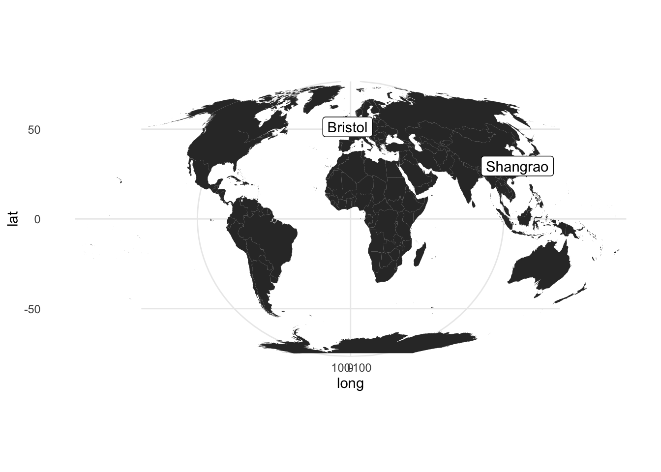
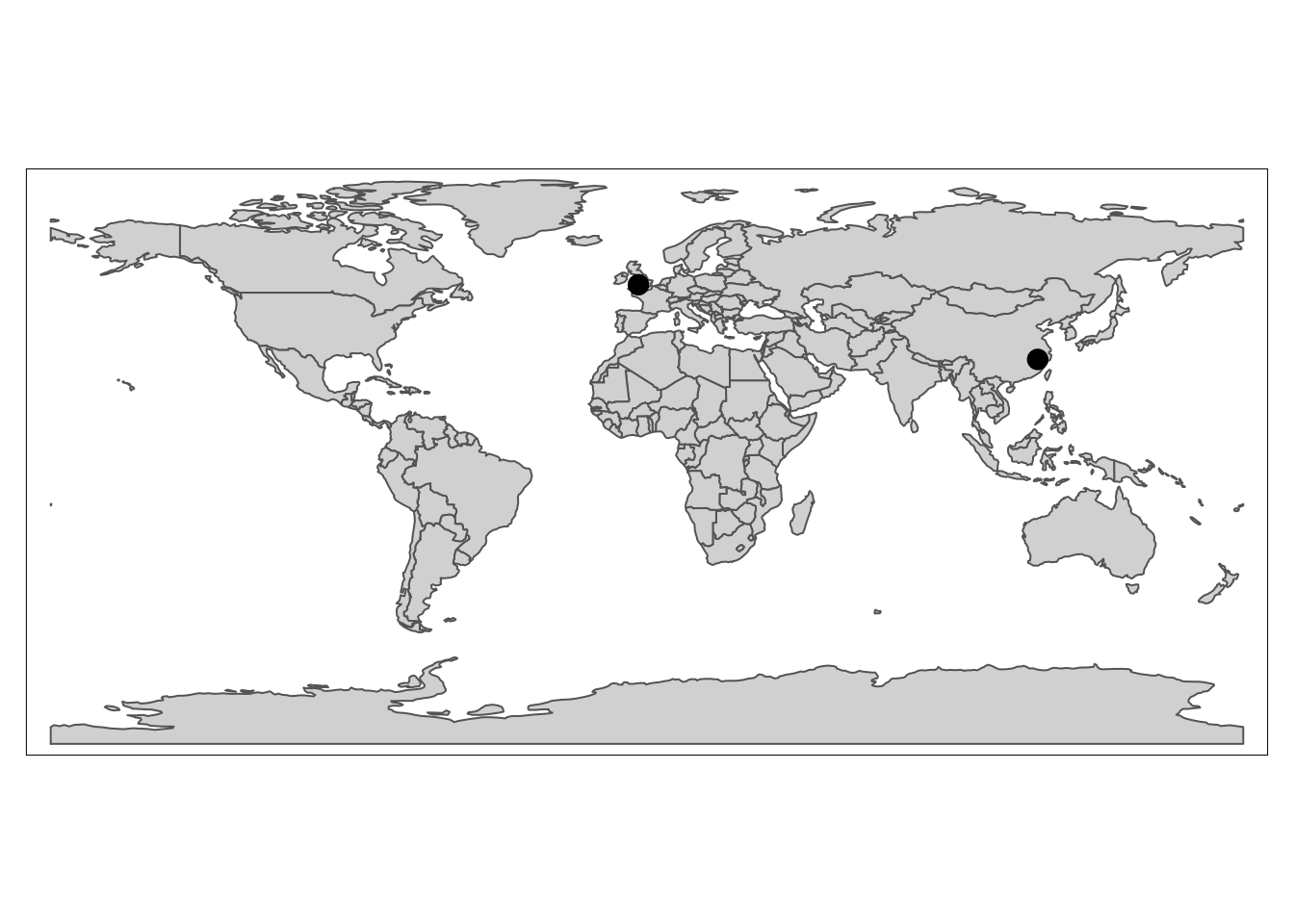
# Here I create a simple dataframe, which can be replaced to your data by read.csv()
toy_df <- data.frame(city = c("Bristol", "Shangrao"),
long = c(51.45, 28.45),
lat = c(-2.59, 117.94))
world <- map_data("world") # a ggplot2 function to get a world data.frame,see also borders
# notice x is lat and y is long, which differs normal impression
ggplot(world) +
geom_polygon(aes(x = long, y = lat, group=group)) +
geom_label(data= toy_df, aes(lat, long, label=city)) +
coord_map("mollweide", xlim=c(-180,180)) + # change the projection
theme_minimal()
|
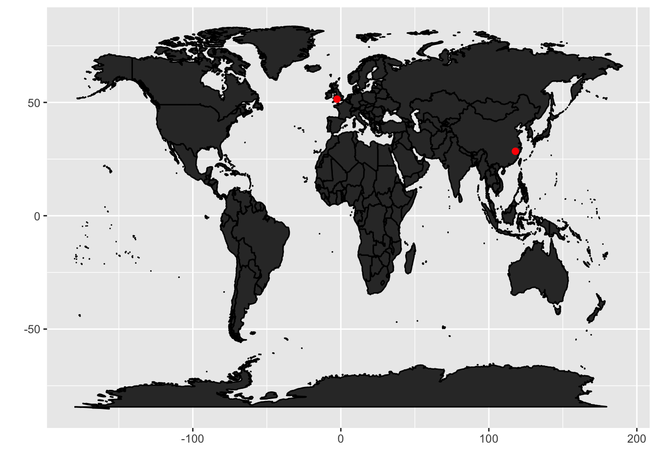
Actuallyggfortify provides the autoplot function, which is a quicker wrapper for ggplot2. So
we can do the same by using less command.
1
2
3
4
5
| library(ggfortify)
world <- map('world', plot = FALSE, fill = TRUE)
autoplot(world, geom = 'polygon') +
geom_point(data = toy_df, aes(lat, long),
color="red", size=2)
|
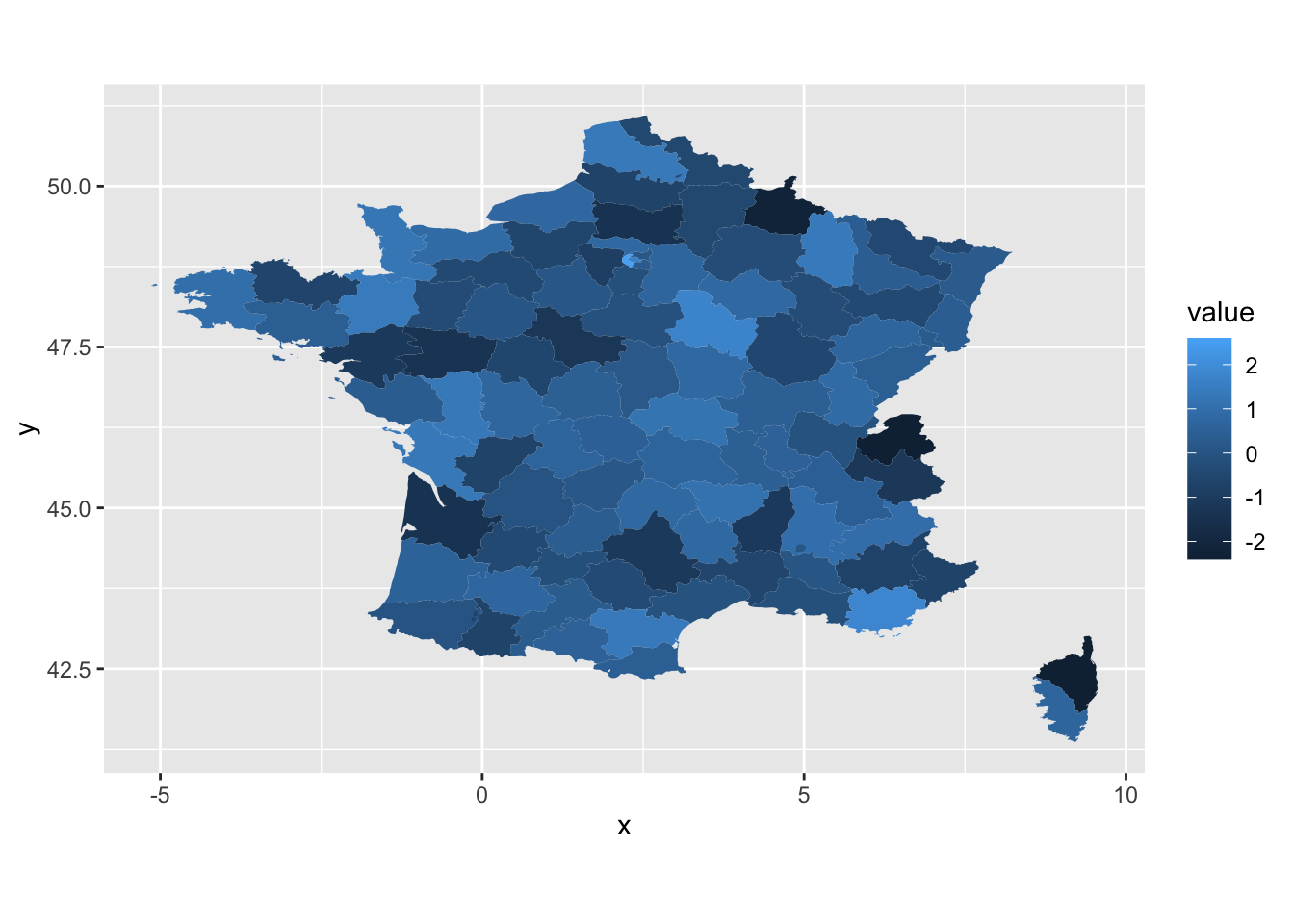
There is another geom type: geom_map in ggplot. The difference between geom_map and
geom_polygon is that the latter just plot the polygon (or position) and does not care about
the value, but the geom_map contains both position and value information. Therefore,
there must be a id columns shared by both polygon and value data frames, but no
need to add lat/long in aes().
An example
1
2
3
4
5
6
7
8
| fr_map <- map_data("france")
fr_data <- data.frame(region = unique(fr_map$region),
value = rnorm(length(unique(fr_map$region))))
ggplot(fr_data, aes(map_id = region)) +
geom_map(aes(fill = value), map=fr_map) +
expand_limits(x = fr_map$long, y = fr_map$lat) +
coord_fixed()
|
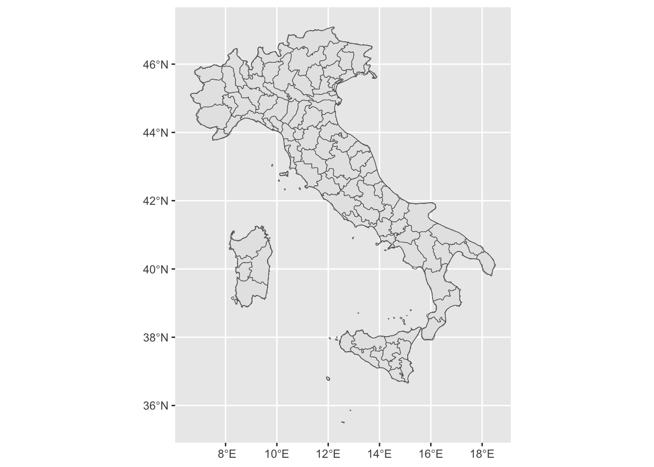
sf object + geom_sf
shp file can be read in R through sf or rgal, and then plot using ggplot .
1
2
| #from https://r-spatial.org/r/2018/10/25/ggplot2-sf.htm
library(sf)
|
1
| ## Linking to GEOS 3.11.0, GDAL 3.5.3, PROJ 9.1.0; sf_use_s2() is TRUE
|
1
| library(rnaturalearth) #another public map data package
|
1
2
3
4
5
6
7
8
| ## The legacy packages maptools, rgdal, and rgeos, underpinning the sp package,
## which was just loaded, will retire in October 2023.
## Please refer to R-spatial evolution reports for details, especially
## https://r-spatial.org/r/2023/05/15/evolution4.html.
## It may be desirable to make the sf package available;
## package maintainers should consider adding sf to Suggests:.
## The sp package is now running under evolution status 2
## (status 2 uses the sf package in place of rgdal)
|
1
| ## Support for Spatial objects (`sp`) will be deprecated in {rnaturalearth} and will be removed in a future release of the package. Please use `sf` objects with {rnaturalearth}. For example: `ne_download(returnclass = 'sf')`
|
1
2
3
4
5
| #library(rnaturalearthdata)
it_data =st_as_sf(map("italy", plot = FALSE, fill = TRUE)) #polygons
it_sf <- ne_countries(scale = "medium", country="italy",returnclass = "sf") #an outline
ggplot(it_sf)+geom_sf()+geom_sf(data = it_data, fill = NA)
|
1
2
| #and you can add more geom_sf() based on data in your hand
#plot(uk_sf$geometry) #uk_sf$geometry equals st_geomety(uk_sf)
|
sf object + tmap
tmap has a similar layer-based syntax to plot map, but should be more professional and specilised than ggplot2.
 1
 2
 3
 4
 5
 6
 7
 8
 9
10
11
| #from https://geocompr.robinlovelace.net/adv-map.html
library(spData)
#library(spDataLarge)
library(tmap)
library(sf)
world <- spData::world
toy_sf <- st_as_sf(toy_df, coords = c("lat", "long"), crs=4326) #WGS84
tm_shape(world)+tm_borders()+tm_fill()+
tm_shape(toy_sf) + tm_dots(size=.5)
|
ggmap
Update: the package ggmap is updated and the related examples are removed (Dec 2023).
ggmap is another friendly package for people from other research background, it provides a function get_map() to download some map data from google, open street map and so on.
ggOceanMaps
ggOceanMaps is a package that I recently found. It is probably the most convenient way to plot pretty ocean maps.
1
2
3
4
5
6
7
8
9
| ## ggOceanMaps: Setting data download folder to a temporary folder
## /var/folders/rq/vks10_qx2l9b08d_pygvwfzh0000gn/T//RtmpL5UN42. This
## means that any downloaded map data need to be downloaded again when you
## restart R. To avoid this problem, change the default path to a
## permanent folder on your computer. Add following lines to your
## .Rprofile file: {.ggOceanMapsenv <- new.env(); .ggOceanMapsenv$datapath
## <- 'YourCustomPath'}. You can use usethis::edit_r_profile() to edit the
## file. '~/ggOceanMapsLargeData' would make it in a writable folder on
## most operating systems.
|
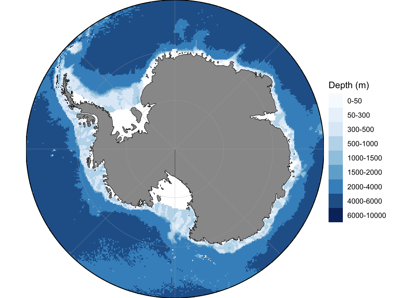
1
2
| ## Plot Antarctic
basemap(limits =-60, bathymetry = TRUE)
|
raster + levelplot/geom_raster
netCDF data can be transformed to raster format.
 1
 2
 3
 4
 5
 6
 7
 8
 9
10
11
12
13
14
15
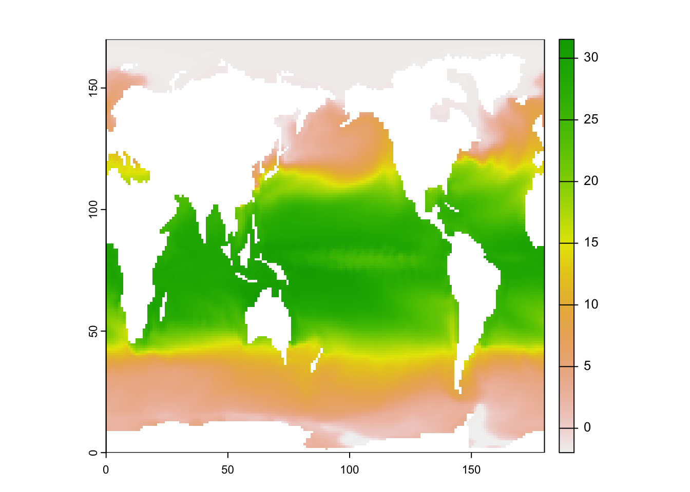
| library(ncdf4)
library(terra)
library(rasterVis)
# an example file from UCAR
# https://www.unidata.ucar.edu/software/netcdf/examples/files.html
nc <- nc_open("tos_O1_2001-2002.nc")
#names(nc$var) # print all variables
sst_K <- ncvar_get(nc, varid="tos") #in Kelvin
sst <- sst_K - 273.15 #in Celsius
#dim(sst) # check dimension
#image(sst[,,1])
sst_raster <- flip(rast(t(sst[,,1])))
plot(sst_raster)
|
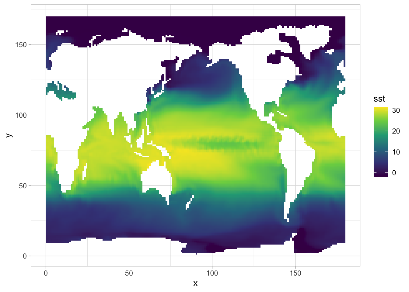
We can also use ggplot to do the plotting. But notice that the array from netCDF is not containing
CRS data, that’s why we have x-y axis with 0-1 range.
1
2
3
4
5
6
| library(ggplot2)
#to use geom_raster/geom_tile, we should transfer raster to a data.frame
sst_df <- sst_raster |> terra::as.data.frame(xy=TRUE) #pipe requires R > 4.1, otherwise use %>% in tidyverse
names(sst_df)[3] <- "sst"
ggplot(sst_df) + geom_raster(aes(x=x, y=y, fill=sst)) + theme_light() + scale_fill_viridis_c()
|
1
2
| # what's the difference between |> and %>%?
#https://stackoverflow.com/questions/67633022/what-are-the-differences-between-rs-new-native-pipe-and-the-magrittr-pipe
|
As for the difference between geom_tile, geom_raster, let’s see the offical answer:
geom_rect() and geom_tile() do the same thing, but are parameterised differently: geom_rect() uses the locations of the four corners (xmin, xmax, ymin and ymax), while geom_tile() uses the center of the tile and its size (x, y, width, height). geom_raster() is a high performance special case for when all the tiles are the same size.
More resources
rworldmap for extra intersting datacowplot for subplot added on ggplot objectsgganimate for animated plotleaflet for interactive map